20220406

Art Around the Corner

While I was working on the Goya in the last post, the folks in charge of NGA's Art Around the Corner program came by to ask if I might be interested in doing some sessions with the students in the January session. I was thrilled to accept, because this program is an opportunity to make a real difference in some kids' lives through art. The NGA partners with DC Public Schools to bring 4th and 5th graders into the Gallery several times a year, not just to look at the art, but to participate in artmaking as they learn to see the world through artists' eyes. It is one of the most gratifying experiences I have had as a painter. To learn more about this program and to see it in action, here's a video made in 2011 which shows how it happens:  https://www.nga.gov/audio-video/video/art-around-the-corner.html


The project this time was portraiture, and the organizers chose this fantastic Van Gogh portrait as the point of departure. My role was to discuss the artist with the kids, give them a chance to talk about what they saw in the painting, and to demonstrate for them how a copyist works to re-create a painting in real time. I worked with several groups over the course of two days, and in addition to Vincent, we talked about other portraitists both within the NGA and without. I discussed Amy Sherald's incredible portrait of Michelle Obama which hangs at the Smithsonian NPG. Many of them had seen it, and all of them lit up when shown an image of that painting. This session happened during the aftermath of George Floyd's murder. One of Amy Sherald's driving principles is that skin color is what we make of it. Her portraits have skin tones greyed out, making the point that we are all the same color, just different shades of light and dark. 


As for Vincent, he's green--and the kids took that idea and ran with it. I wish I had images of their work, which truly turned out far superior to my own. Below is my setup for the first session and near completion on the second day. 

This was February 2020. I was already seeing more international visitors wearing masks, and was just starting to wonder how concerned I should be about Covid, since as a Copyist, I was constantly engaged with people in the gallery, having animated discussions about my work, the art and the artists--my favorite part of the job. Then a month later, official lockdown began, and everything closed down. Even now I don't know if this program was reinstated after things opened up again. My husband and I left DC after a full year of hard isolation, just as soon as we were vaccinated. 

I hope that this won't turn out to have been the last time I set foot in the National Gallery, or the last time I paint there. It is the last time for the foreseeable future. Here's a photo from happier times. 

Photo credit: Sandra J Cohen (a great portraitist)


20220124

Goya, Phillips, Cezanne


This is Goya's portrait of Bartolome Sureda y Miserol, from 1803-4. My version is near completion here, I did change the aspect ratio just a bit. The subject was a friend of Goya's, and was quite an ambitious and interesting person. This was the penultimate painting I did as a copyist, finished December 2019. While working on this, I was asked to do a commission of a painting attributed to John Phillips, with only a poor-resolution photo for reference. The painting (on linen panel) turned out well, and the clients became good friends. Completed just before lockdown began in 2020.


There was one more NGA painting that I started in January 2020, Cezanne's "Houses in Provence: Riaux Valley near L'Estaque". I had finished the underpainting in raw sienna, when a visitor to the NGA fell in love with it just as it was, so I happily sold it to her since I knew I needed a break. 


20220115

catching our breath

It's a different world than it was when I last posted here over two years ago. The pandemic started, and since I was living in DC (one of the highest rates of infection in the country); being in a high-risk group, I was in hard lockdown for over a year. My painting and teaching at the National Gallery came to a halt, along with everything else. My husband's work also ceased, and we made plans to return to Southern California as soon as we could get vaccinated and travel safely. 

Now, after 8 months back in San Diego, we're still at risk despite being vaccinated and boosted, so we are adapting. I miss the work that I loved so much at the NGA: painting, interacting with visitors from all over the world, working with DC Public School Elementary students in the Art Around the Corner program, painting commissions...all gone. My brother very nearly died of Covid (pre-vaccine) but fortunately he survived. Some dear friends did not. Nearly a million people in the US have been lost to this virus. We can't long for a return to normal, because that normal is gone. It's a different world now. 

For a long time, making any kind of art was out of the question. For many creatives, this has been a terrible time. I took down my website. I still have all my oil painting materials, but still can't bear to look at them. Instead, what feels hopeful is change...as in every aspect of life. I've dabbled in watercolor over the years--some attempts are posted here--but never reached the level of expression that I wanted in that medium. I always said that I have a love-hate relationship with watercolor: I love it, it hates me. That's about to change.

Now that no one's watching (since I'm not posting), I can really delve into how this medium works and try to find my voice in it. In art school, watercolor was not a medium that got any respect, so we just didn't talk about it. That's okay. Finding one's way in a medium is always personal, no matter how much instruction one receives. 

As I find my way, I'll post some exercises here and share experience. First though, I'll catch up a little with some of the last work that I did at the National Gallery, just to close that out. I've documented my painting life on this blog since 2005, so I'll fill in the gap and then, move on.

20191025

Post Emily

Life has been quite a ride this past two months, including moving (twice) and having an up-close-and-personal encounter with an unwell wild bat which necessitated a series of post-exposure rabies vaccines. But what do we do when life happens? We keep painting.

I finished working from Portrait of My Grandmother two weeks ago, and there may be some tweaks that I'll add in the home studio but all in all, it turned out very well. This is 36" x 24", and I will post some progress shots below.


Can you tell that my favorite element in this painting is her hands? They almost painted themselves. Here is a look back at from the start.


Motley's painting is loaded with texture. He painted it on a rough canvas laundry bag, as mentioned in the previous post, and he worked in thick layers of paint over that rough support. There are places where his brush visibly skipped over wrinkles that were already forming, before the painting was even done. To suggest that texture on my comparatively smooth canvas, I used thick random brushstrokes and layers. In the first session, I tried to get the drawing and composition more or less there, and laid on a lot of paint. From there it was mainly corrections and refinement.


I don't know if Motley used an underpainting, we don't know much about his process especially for these early paintings that weren't his mature style. I used burnt sienna for the wash and drawing, and then fought it the rest of the way to get her coloring accurate.


I don't normally paint in a "serial" fashion, meaning I normally work up the whole surface of the canvas as a unit, not one area and then another area. Motley's painting shows dark outlines around the hands, as if he drew their placement and then painted them separately later. This painting was almost certainly done from life, and an 80-year-old woman would not be able to hold a pose for a very long time...so it would make sense for him to work the more challenging sections (face and hands) to completion one at a time. That was how I painted her hands. Established the shape and then in one session, painted them in.

Her face is a portrait of character, dignity, life history. It was by far the most challenging part of my painting. I kept putting emotions there which were mine, not hers. She's not sad in Motley's painting, but I kept finding sadness in mine. Portrait painters connect with subjects and ideally, paint the essence of the sitter. That's where being a copyist is different. Motley painted Emily with his own lifetime knowledge of her. In the end, his is a painting of Emily. Mine will always be a painting of a painting. Over the ten weeks that I worked on this, I met a lot of sincerely interested visitors and I got to share Emily's story with countless people. I wanted to do her justice, and hope that I did. 

20190821

Emily

The Kenyon Cox piece is finished, I'll update the image in the previous post. The next project will be this glorious painting by Archibald Motley Jr., a work which was just acquired by the National Gallery from the artist's family late last year:


The lady whose portrait this is, Emily Motley, is the artist's grandmother. She was born into slavery in 1842, and freed when she was about 20. Married a Native American who had also been a slave, and they raised a beautiful, successful family. Archibald Motley Jr. graduated from the Art Institute in Chicago in 1918 and struggled to succeed as a painter, so he worked as a porter on the Wolverine, a train from Chicago to Detroit. His father was also a porter on that train, one of the best jobs available to African Americans at that time. Motley could not afford to buy quality art supplies, so he used a canvas laundry bag from the train as a support for this painting. This explains the extraordinary texture, which I'll talk more about as I work. He struggled for a long time to finally become successful as a modernist, totally different style, but his portrait and the other one of his grandmother are his finest work IMO and they were his favorite paintings. She was about 80 when this was painted in 1922.

I highly recommend the supporting material on the NGA website, with videos that really expand on one's understanding of the importance of this work. Curator Nancy Anderson's talk is absolutely wonderful, providing essential context and enlightenment about this work.

The other painting of Emily is the richly symbolic "Mending Socks", 1924, which is in the collection of the Ackland Museum in Chapel Hill NC. I had the opportunity last month to view that work and the curatorial file, which is filled with articles, interviews and documentation relating to both these works. I'll have more to say as my work progresses.


20190629

Progress, and old business

Making good progress on Kenyon Cox, might be completed in one more session. Still a lot to do, but it's coming together well.
The main reason for painting from master works is to learn, and (if it's not a commission), there's a point at which I've learned what this artist had to teach me, so it's okay to move on. I work quickly, a result of my plein air landscape work. More can be done in the studio later...but usually there's not much left to do.  

Here are some works from last fall, before the layoff. First up, Chardin's Still Life with White Mug:

16" x 20" and done in one four-hour sitting. The original looked very much like it had been done that way, premier coup or alla prima, so that was my plan as well. Chardin painted this late in his career, and it's filled with confidence and bravado. He painted the one right below (Fruit, Jug, and a Glass) 50 years earlier and it has the more tentative and labored feel of a young painter with something to prove. 

This Van der Neer Moonlit Landscape was an exercise in establishing nocturnal values. I wasn't concerned about the extremely fine details which are strewn throughout this painting like Easter eggs. Aert Van der Neer was known for his nocturnal landscapes during his lifetime.

Finally, this still life by Willem Kalf was technically fascinating. This painting, like so many others, has had an interesting and uneasy life. They are like humans in that way: they survive some rough or unfortunate treatment and bear the scars of that, but their beauty shines through. This painting had a huge tear in it at one point, had been overcleaned and inpainted to a shocking degree, but was restored to its original, sublime beauty by the best conservators in the world: those at the NGA. I didn't quite finish this on site before my sabbatical, but it won't take much to get it there. It's a classical 17th century Dutch still life, peaceful and lovely, belying its turbulent past.

20190622

Back to Work

After a layoff for some health issues and a digression into more drawing and watercolor, it's back to work in oil at the National Gallery. The painting I'm working from now is "Flying Shadows" by Kenyon Cox. This painting was acquired as part of the merger with the Corcoran collection, so it's only been at the NGA since 2015. There isn't a high-res image of it yet on the NGA site, nor many notes about its technical and historical background, but the Corcoran site still has an extensive entry on it for the scholars among you. The life of the physical painting is always fascinating, all that it has been through to reach its present state. Just like a human, it bears the evidence of some hard times but its beauty shines through.

Here's the start of day 1 and the end of day 2:


My canvas is 20 X 24". Still a long ways to go, many corrections and layers to add.

Kenyon Cox was a very important painter, illustrator, and muralist in the Academic Classical style. He trained at PAFA and in Paris. This landscape is an early work in his oeuvre, a bit looser than his later work. He taught at the Art Students League, where he applied the ancient dictum "Nulla Dies Sine Linea"--no day without a line (of drawing), still the best advice for artists of all kinds. There are a number of his drawings in the NGA collection as well.

The painting has a buff-colored ground and no overall undertone. It seems constructed of many thin layers built up to portray the lush softness of the grassy fields and the trees. That's my strategy, to get the soft, subtle glow of gentle color coming through. The biggest challenge is to tone down my usually-brighter palette without killing it. Landscape is definitely in my comfort zone, and Kenyon Cox has a lot to say about it.

20180721

Rembrandt and Vermeer, finished

This one is done now, and I'm very happy with the result. I've also finished a Vermeer commission, and will post that below the Rembrandt.


 24 x 20" oil/canvas. There were issues with copying this one in person, largely due to darkening over time and glare within the gallery. The high-resolution images on the NGA.gov website were immensely helpful. In person, this is a very successful painting and has a real presence. Here are a couple detail shots. Use "open link in new tab" to see the fully enlarged image.


The Vermeer which was begun months ago is finished as well, I blogged about it before here. The final painting and some detail shots are below.

24 x 20", oil on canvas. Source imagery thanks to the Rijksmuseum.

Details ("open link in new tab"):


If you missed the earlier  post, there is a lot of great information about the meanings of these objects here. The symbolism has been debated for centuries, but even just the literal meanings of these objects are fascinating. The bread basket was hung on the wall to keep the bread away from mice. The dark object above that is a framed picture. The footwarmer on the floor has been interpreted as sexual metaphor (heat under the skirt), especially given the Cupid tile next to it and her bare arm, but it was also a practical fixture in daily life.

20180526

Rembrandt in Progress

This is a lovely Rembrandt portrait at the National Gallery, and a copy was commissioned by the good people who bought my painting of the Lievens Bearded Man.


We do not know the identity of the sitter, it hangs side-by-side with this portrait, and it seems that this pair of portraits might be husband and wife. Rembrandt made many portraits of wealthy Dutch people who are not known to us now. This pair of portraits has a very interesting provenance involving the Yusupov family, surviving both the Napoleonic invasion of Russia and the Bolshevik revolution. The paintings were taken off their stretchers, rolled up and smuggled out of Yalta aboard a British ship. They are now part of the National Gallery's permanent collection.

I'm three sessions into the Rembrandt, and the work is coming together. It's a difficult painting to work from even in person, because the dark parts are very dark. It's not due to old varnish, this painting had a complete conservation in 2007; but the contours in the drapery have darkened to near-imperceptibility. My guess is that Rembrandt used lead white as a lightener to describe the folds, and that has now darkened and become nearly as black as the areas around it. The high-res image on the NGA website is actually much better, because it was taken under very bright light which reveals more of the contrast than can be seen in person. Another very interesting fact about this painting is that it was transferred from one canvas to another (not relined, actually transferred) by a Russian conservationist during the 1800's. It wouldn't seem even possible, and is not a method that modern conservation would employ (since all modern conservation measures MUST be reversible), but it was commonly done then. Here is a link about the process to transfer a painting from one support to another, among the riskiest procedures ever used. Here's a link to the technical notes about this specific painting.


Work in progress, 24" X 20". Excuse the glare!

20180525

Vermeer and Duchamp

Two projects in process currently: a commission for Vermeer's Milkmaid, and a commissioned Rembrandt at the National Gallery.

The Vermeer is a huge challenge, especially because I can't work from the original which is in the Netherlands. So, I requested a high-resolution image and information from the Rijksmuseum, which they very kindly sent. This link is a wealth of information about this painting, Vermeer's masterwork, which is full of symbolism and sublime beauty. When I took it on, I didn't realize how much difference it would make that I couldn't see the actual work. The authoritative image is only as good as the monitor with which one views it, so I loaded it onto several computers and tried to sort of "average" the color interpretation.

Here is the work in progress, probably 2-3 weeks from being finished, lots of adjustments and details to be done:


24" x 20", oil/stretched canvas

The other commission I've done recently is Duchamp's Nude Descending a Staircase, for a very dear friend and fellow artist who traded an original work for it. I was the winner in that deal. :)


This work was outside my comfort zone for sure, but I learned so much about how Duchamp worked. 13" x  9", oil/stretched canvas


20180211

Pope Innocent X

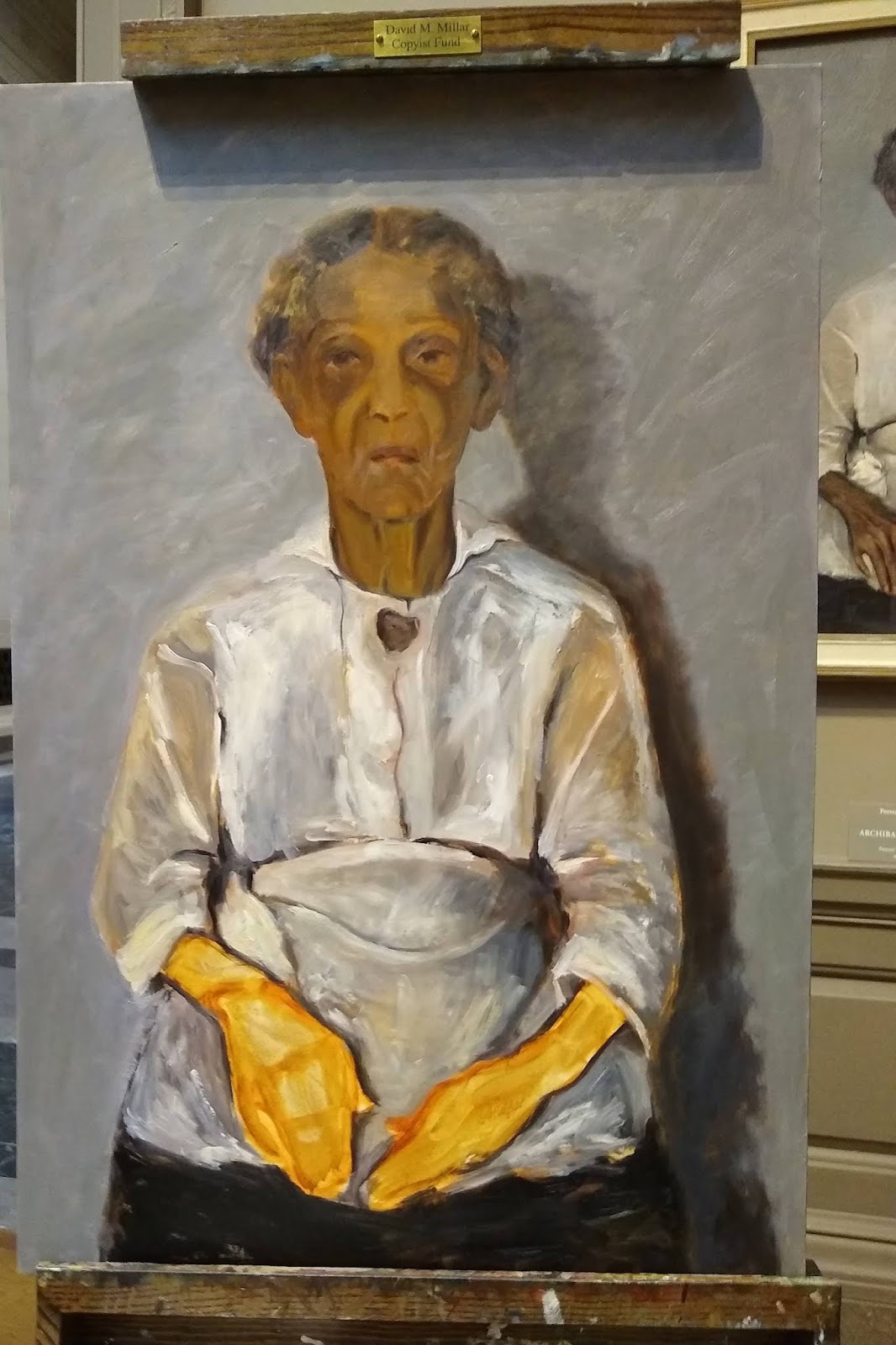
I'm wrapping up my latest National Gallery Copyist painting, and this one has an interesting background. I'll also talk more about the process and numerous benefits of copying, at the end of this post.

Here is the almost-finished painting, in front of the original:


We must use a larger or smaller support than the original. Since there are other references in a larger format (see below), I chose to go bigger (24 x 18), and the proportions are a bit different.

The original and the details of it can be seen on the NGA website, here. This painting was bought by Andrew W. Mellon in 1930 as an original Velazquez, but scholars have since established it as "Circle of Velazquez". Velazquez painted the full size portrait of Pope Innocent X in Rome, here is an image of that:


This portrait is still in Rome. The Pope, upon seeing it, said "Troppo vero, troppo vero!" Too true! (This is the work that inspired Francis Bacon's Screaming Pope paintings in the 1950's)

Then, Velazquez painted what is known as an "autograph replica"--a copy of his original, for himself. That painting now resides in London, and here is an image of it:


Both of these are known to be by the hand of Velazquez, so the work at the NGA was assumed to be another replica or study also painted by Velazquez.


 Time and modern technology have made better assessment possible...there is an unrelated painting underneath it. In addition, the expression and other elements have become a little bit exaggerated. On the ear, there is a visible series of dots--revealing a process that was frequently used to transfer an image. This was most likely painted by a workshop assistant or student, on a discarded canvas. We can't possibly know for sure, but the evidence seems compelling.

In making my copy, I decided to undo some of the distortion of the eyes and brow, and make mine closer to the original or the autograph replica--both of which have a much more believable expression. I referred to high-resolution images of those works, and relied on the paint and brushwork of the painting in front of me. 

My process, as in the past, is to paint from what's in front of me. No tracing or mechanical transfer of the image, because duplication is not my goal...learning is. While I'm grappling with visualizing the original, my errors are woven in and my own voice shows through. This is the greatest gift of copying, I think. It's a lesson from a master, but ultimately it comes through me and produces something original, just as this "Circle of Velazquez" rendition did for whomever painted it.

Copying is a standard part of an artist's training in school and beyond. We see differently and absorb things in a unique way when we copy--written, drawn or painted. Linda Barry likens it to singing along with a song you love, because it takes you somewhere. And yet, the voice is yours.

My result, minus final touches:

20171216

Lievens nearing completion

Probably one session left to finish this.


Up close, there is still quite a bit to do. We must keep the materials at least 4 feet from the painting, so adding a couple feet for the distance to my eyes, I'm actually about 6 feet away while working. From that distance, my copy looks amazing; but then I step up close, and the perfection in the original makes me want to hang up my brushes.

Lievens did quite a few paintings of this same model. Here are some links with images of other "tronies". I think it had to be the same model.

Sotheby's and Christie's

The magical part of copying a work is not knowing how some of the effects were created, then accidentally stumbling onto those methods while working. Like happy accidents, those "ah-ha" moments are what make the exercise so valuable.

20171215

Portrait project 4


Here are two portraits of the same sitter, and a story to go along with them. I'll start with the one that I feel best captures who he is.


He's confident, happy, has a megawatt smile. He's also a busy professional with very little free time. He's a football fan (Go Redskins!), so when he came by for a sitting, he asked if he could listen to the game on headphones while I sketched him. I always want people to be comfortable and at ease while I'm working, so I said sure! Unfortunately, the team missed a field goal and fell behind, so the expression I got was actually more like this:


Not that there's anything wrong with that, I was very taken with the drama that unfolded on his face, but I struggled terribly to complete an accurate likeness (later repainted it 8 times, and then abandoned)--because this really isn't who he is. Fortunately, I had time to chat with him enough to get to know him, and took some reference photos--one of which enabled me to get the likeness in the top image here. 

Yesterday I happened to talk to another portrait painter while painting at the National Gallery, and she mentioned how difficult it is to get people to come for a live sitting at all any more; they would rather just submit photos. People are busy, which is understandable, but a portrait painted from a photo without the benefit of "face time" with a sitter will never capture the same energy and character. There's something sublime that happens between the subject and the painter, that makes it possible to portray the sitter's best self: a blend of how they see themselves, how the painter sees them, and the essence of their personality. I am glad I had enough time with this guy to get to know him a little, because that's what saved me.


20171202

Lievens in progress


Last week, my husband took this shot of me working on my Lievens copy. Made good progress this week, starting the eyes and some of the skin tones:


The eyes, even unfinished, have brought the figure to life. Visitors love that, and for good reason. It's much easier now to envision the whole face. There is still much to do, probably three more sessions. I'm reserving the beard for last, because that seems to be the order that Lievens followed. The paint and scoring that make up the "whiskers" clearly overlap the skin and clothing.

I am using only an earth palette. Although I brought chromatic primaries with me, I didn't touch them. The "blue" eyes are painted with black and white, which is almost certainly what Lievens did. In isolation the color is grey, but in the warm context of the skin, they look very blue. Other than that, I'm using yellow ochre or raw sienna, earth red, burnt sienna and burnt umber. As for painting medium, I would love to use Venice turp which would give a lot more traction especially for the thicker passages of the skin, but real turpentine is not allowed in the NGA because of the stronger smell. Walnut alkyd medium works great for the glazing, adding translucency and a hint of tack and traction.Walnut oil is a nod to the original, since these masters were thought to use walnut rather than linseed. The alkyd helps it dry much more quickly than walnut or even stand oil would, alone.

If you haven't listened to the NGA podcasts about Jan Lievens, there are links in this post. Here is a slightly closer view of the copy at the end of the day:


20171118

Portrait Project 2 & 3

Here are the second and third in the series of portraits. In these difficult times, portrait painting makes me feel more connected than anything else to my fellow humans.


Haley and John, 12 x 12 oil on canvas.

20171117

New Copyist project: Jan Lievens

Here is the final image of my rendition of Van Gogh's Roses. I learned a lot about how he applied paint, especially as I worked the last stages. Much of what I attributed to the difference in paint texture was actually due to the manipulation with the end of the brush handle--some passages he didn't even apply with a brush, just drew them in with the end of the handle. That was a revelation.


My next project is pretty much the other end of the spectrum from Van Gogh. Jan Lievens (1607-1674) was a contemporary, friend, rival, and studio-mate of Rembrandt. He was very successful during his lifetime, but fell into relative obscurity afterward for various reasons. His work is incredibly luminous, like Rembrandt's, and in fact much of Lievens' work was attributed to Rembrandt for some time. Finally emerging from Rembrandt's shadow, Lievens has gotten the credit he is due.

In 2008 the National Gallery mounted an exhibition devoted to Lievens, and produced three 8-minute podcasts which are still available online. Listen to them here:
https://www.nga.gov/audio-video/audio/liev-wheel1.html
https://www.nga.gov/audio-video/audio/liev-wheel2.html
https://www.nga.gov/audio-video/audio/liev-wheel3.html

Here is a self-portrait from about age 20, when he was considered a prodigy:


Lievens and Rembrandt both painted many character studies, known as "tronies". The painting that I'm working from is one of them:


This is "Bearded Man with a Beret", from circa 1630, approx 21 X 18 inches. The description on the National Gallery website can be found here, as well as a high-resolution image that you can zoom in on to see the astonishing detail: 

This painting is on wood panel, so to approximate the smooth surface, I'm using Gamblin Oil Ground over gessoed smooth canvas. The surface of the wood panel shows through in areas where Lievens carved out shapes (more about that later), so I toned my surface to roughly that color. 

It's difficult to see in this photo just how much the painting seems to glow in real life. The skin is luminous, the eyes glisten, it's a masterful work. Lievens' glazing technique utilized a lot of the underpainting in an intense burnt sienna or earth red, showing through the thinly scumbled layer glazed over it. This is perhaps most visible in the chest area, where the grey of the garment is laid in very thinly, as is the deep umber of the background. For the first two sessions, I've worked on laying out a correct drawing on my canvas, and glazing an underpainting, trying to "reverse engineer' how Lievens established his values and what colors would show through where.

Here's a shot of my setup, halfway through the second session:


And at the end of the day:


I see corrections to the drawing that still need to be made, and since so much of the underpainting shows in the finished work, it really needs to be correct from the ground up.