20171027

Progress on Van Gogh

Hoping to complete this next week. I'm restoring a little bit of the pink that Van Gogh intended, trying to be faithful both to his intent and to the current reality. If you haven't watched the video produced by the Met, it's a phenomenal synopsis of this painting's context in his work and approximations of what it looked like.
 https://www.youtube.com/watch?v=wJM3JhAfad8

After session #4, here's my copy.


20171018

Patuxent River from Mt Calvert

Here's a field sketch done at Mt Calvert Historical and Archeological Park in Upper Marlboro MD, overlooking the Patuxent River.

6 x 8" oil on gessoed bamboo card

20171012

Roses continued

Second session, my setup. This is how far I got after 8 hours total:


I'm taking pains to get the drawing right, especially since I've changed the proportions slightly. Using gridlines as a guide when drawing, allows those adjustments to made accurately across the whole surface. I've been reading a lot about how Vincent worked. That background color was applied in a thin layer at first, then the thick ribbons of  diagonal texture were some of the last strokes he added. He used dark blue to lay in the drawing, and those lines remain very visible and an important part of the composition.

Session 3, I'm starting on the leaves and flowers.


This is one of very few Van Gogh's to show revisions. Normally he painted very quickly with few revisions or corrections. Here, he added roses to the bottom of the vase and a sprig at left to correspond to one of the accompanying paintings. If you haven't watched the Met video yet, it's truly worth 8 minutes of time to understand so much more about this series of flowers.

The color issue: He used geranium lake, along with red lead in other paintings possibly because he knew that the lakes were fugitive but letters to Theo for needed supplies specify tubes of geranium lake for these paintings. His strategy, described in his letters, was to overload the color to compensate for future fading, but he couldn't have known they would fade all the way to white.

It's hard to know how much pink to put back. We have some photos from the 1920's and 30's but how reliable can those be? Color reproduction was dismal then, but we do know for certain that these roses were originally mostly pink:


20171009

Van Gogh Roses

Starting a new copy at the NGA, of Van Gogh's Roses. Here is the original:


This was painted in May of 1890, during his last hospital stay just two months before his death, as part of a series of four floral still lifes. The Met had a show in 2015 of all four, which included this painting from the NGA, one from the Netherlands, and the other two which are in the Met's collection. I'll be talking more about that exhibition and the scholarship that followed.

The value in copying a work like this is that it is radically different from the way I normally paint, which makes it a great exercise. The description on the NGA site notes that the roses used to be pink, but the fugitive pigment has faded so much that they are now almost entirely white. That inspired me to look up the research on what pigments he used, and what he may have intended them to look like. I want to share as much background as possible with curious visitors, and there is a lot to tell them about this painting. I highly recommend this 8-minute video produced by the Met for their exhibition, for the context of this work. The discussion of Van Gogh's fugitive colors begins at the 4-minute mark.

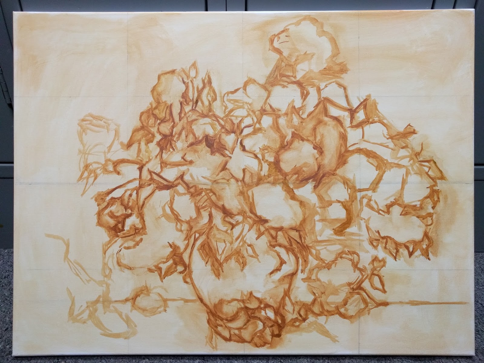
First session, I focused on the drawing. The proportions of my canvas are different but much closer than the Haseltine. 


There is a LOT going on in this bouquet. While Vincent was able to freestyle the composition as the flowers inspired him, my mission is to copy his work so my drawing has to be as close to his as possible. That's a much slower process, and this was all I could muster in 4.5 hours. His canvas shows through much more than one would think, given the impasto nature of most passages. The canvas that can be plainly seen is a buff color, so I chose raw sienna to tone my bright white canvas.

I'm reading a lot about Vincent's endlessly-fascinating life, which remains a source of interest and curiosity among those admiring his work. Two weeks ago, the NYTimes published an article about "Starry Selfies"-- New York's MOMA has a constant stream of people taking selfies in front of Van Gogh's "Starry Night". At the time, I was finishing up the Haseltine and thought "wow, that doesn't seem to happen at the NGA!" Turns out, it does happen here too, and the "selfie magnet" is hanging two paintings away from the Roses. It's this one:


20171004

the Portrait Project

Since I've just moved across six time zones to a new apartment community, I thought about this project as a way to meet my neighbors while sharpening my portrait skills. I posted the idea on the community web page, and got some interest. This is the first portrait of hopefully many. He's a retired Coast Guard veteran and cancer survivor. He moved here about the same time we did.

12 x 12 square, stretched canvas. I've also begun a new copy at the National Gallery, a Van Gogh. We'll see what happens with that!