Showing posts with label still life. Show all posts

20190629

Progress, and old business

Making good progress on Kenyon Cox, might be completed in one more session. Still a lot to do, but it's coming together well.
The main reason for painting from master works is to learn, and (if it's not a commission), there's a point at which I've learned what this artist had to teach me, so it's okay to move on. I work quickly, a result of my plein air landscape work. More can be done in the studio later...but usually there's not much left to do.  

Here are some works from last fall, before the layoff. First up, Chardin's Still Life with White Mug:

16" x 20" and done in one four-hour sitting. The original looked very much like it had been done that way, premier coup or alla prima, so that was my plan as well. Chardin painted this late in his career, and it's filled with confidence and bravado. He painted the one right below (Fruit, Jug, and a Glass) 50 years earlier and it has the more tentative and labored feel of a young painter with something to prove. 

This Van der Neer Moonlit Landscape was an exercise in establishing nocturnal values. I wasn't concerned about the extremely fine details which are strewn throughout this painting like Easter eggs. Aert Van der Neer was known for his nocturnal landscapes during his lifetime.

Finally, this still life by Willem Kalf was technically fascinating. This painting, like so many others, has had an interesting and uneasy life. Paintings can survive some unfortunate treatment and bear the scars of that, and be fully restored in the hands of a skilled conservator. This painting had a huge tear in it at one point, had been overcleaned and inpainted to a shocking degree, even had one of the glass objects painted out... but was restored to its original beauty by the best conservators in the world: those at the NGA. I didn't quite finish this on site before my sabbatical, but it won't take much to get it there. It's a classical 17th century Dutch still life, peaceful and lovely, belying its turbulent past.

20171027

Progress on Van Gogh

Hoping to complete this next week. I'm restoring a little bit of the pink that Van Gogh intended, trying to be faithful both to his intent and to the current reality. If you haven't watched the video produced by the Met, it's a phenomenal synopsis of this painting's context in his work and approximations of what it looked like.
 https://www.youtube.com/watch?v=wJM3JhAfad8

After session #4, here's my copy.


20171012

Roses continued

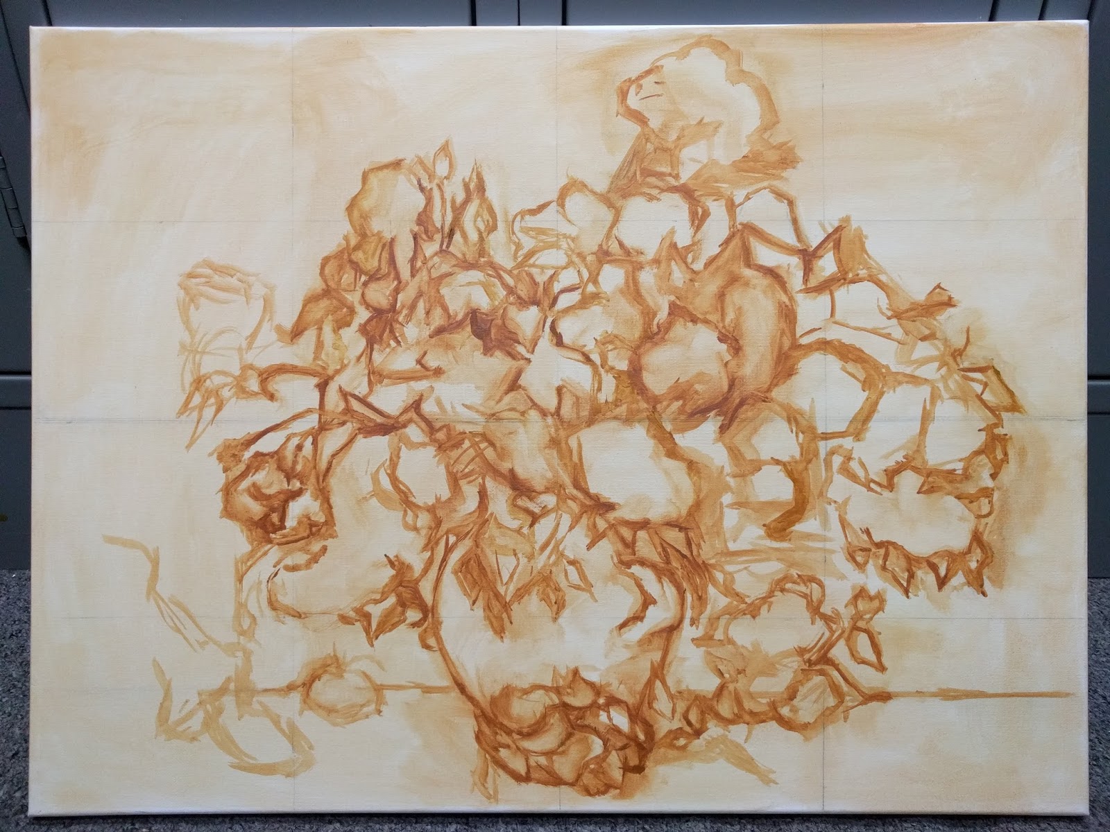
Second session, my setup. This is how far I got after 8 hours total:


I'm taking pains to get the drawing right, especially since I've changed the proportions slightly. Using gridlines as a guide when drawing, allows those adjustments to made accurately across the whole surface. I've been reading a lot about how Vincent worked. That background color was applied in a thin layer at first, then the thick ribbons of  diagonal texture were some of the last strokes he added. He used dark blue to lay in the drawing, and those lines remain very visible and an important part of the composition.

Session 3, I'm starting on the leaves and flowers.


This is one of very few Van Gogh's to show revisions. Normally he painted very quickly with few revisions or corrections. Here, he added roses to the bottom of the vase and a sprig at left to correspond to one of the accompanying paintings. If you haven't watched the Met video yet, it's truly worth 8 minutes of time to understand so much more about this series of flowers.

The color issue: He used geranium lake, along with red lead in other paintings possibly because he knew that the lakes were fugitive but letters to Theo for needed supplies specify tubes of geranium lake for these paintings. His strategy, described in his letters, was to overload the color to compensate for future fading, but he couldn't have known they would fade all the way to white.

It's hard to know how much pink to put back. We have some photos from the 1920's and 30's but how reliable can those be? Color reproduction was dismal then, but we do know for certain that these roses were originally mostly pink:


20171009

Van Gogh Roses

Starting a new copy at the NGA, of Van Gogh's Roses. Here is the original:


This was painted in May of 1890, during his last hospital stay just two months before his death, as part of a series of four floral still lifes. The Met had a show in 2015 of all four, which included this painting from the NGA, one from the Netherlands, and the other two which are in the Met's collection. I'll be talking more about that exhibition and the scholarship that followed.

The value in copying a work like this is that it is radically different from the way I normally paint, which makes it a great exercise. The description on the NGA site notes that the roses used to be pink, but the fugitive pigment has faded so much that they are now almost entirely white. That inspired me to look up the research on what pigments he used, and what he may have intended them to look like. I want to share as much background as possible with curious visitors, and there is a lot to tell them about this painting. I highly recommend this 8-minute video produced by the Met for their exhibition, for the context of this work. The discussion of Van Gogh's fugitive colors begins at the 4-minute mark.

First session, I focused on the drawing. The proportions of my canvas are different but much closer than the Haseltine. 


There is a LOT going on in this bouquet. While Vincent was able to freestyle the composition as the flowers inspired him, my mission is to copy his work so my drawing has to be as close to his as possible. That's a much slower process, and this was all I could muster in 4.5 hours. His canvas shows through much more than one would think, given the impasto nature of most passages. The canvas that can be plainly seen is a buff color, so I chose raw sienna to tone my bright white canvas.

I'm reading a lot about Vincent's endlessly-fascinating life, which remains a source of interest and curiosity among those admiring his work. Two weeks ago, the NYTimes published an article about "Starry Selfies"-- New York's MOMA has a constant stream of people taking selfies in front of Van Gogh's "Starry Night". At the time, I was finishing up the Haseltine and thought "wow, that doesn't seem to happen at the NGA!" Turns out, it does happen here too, and the "selfie magnet" is hanging two paintings away from the Roses. It's this one:


20160622

Found Roses

8 x 6", oil on card

Found a whole arrangement of these in the trash, and picked out the best three to paint.  Hawaiians throw away some very nice, useful things.  Hard to understand, when things are expensive and not always easy to get here.

20120202

Dahlias revisited


14" X 11", oil on linen panel.  Awarded Honorable Mention, Art In Bloom, San Diego 2011

20111225

Happy New Year!

Sincere greetings of the season, and happy Solstice--days are getting longer, at last!  Many thanks to everyone who has taken the time to look at my work, I'm very grateful to all of you who stop by.


 Cherry Pie, 6" X 8", oil on canvas panel

And the paintings below have been selected for a group show at a terrific gallery in downtown San Diego, L Street Fine Art, with a reception the evening of February 4, 2012.  The theme of the show is abstraction.  Here they are:

 June Gloom and Jacarandas, 6" X 6" oil on Ampersand Gessobord panel


La Playa Cove Morning, 8" X 6" oil on canvas panel

Dudleya (Live Forever), 10" X 8" oil on panel

20111005

Emerald Building show and Upcoming Paint-out


I have a show of 10 paintings from the Cabrillo Artist in Residence project, showing in the display window of the Emerald Building in Downtown San Diego, at C Street and Columbia.  Around the corner are four still lifes in another window.

Old Lighthouse Parlor


10" X 8", oil on panel.   The interior of the Old Lighthouse was also the living quarters for the lighthouse keeper and his family.  In the late 1800's when this was an active lighthouse, the lighting was by lamplight, so probably never very bright inside.  It's been kept pretty much as it was, almost a time capsule.  I'm looking at it through a plexiglass viewing window, and the dark atmosphere is probably pretty true to how they lived.  


6" X 8", oil/cp.  These are the brass oilcans that the Keeper used to replenish the oil that illuminated the Fresnel Lens atop the Old Lighthouse.  They are beautiful objects.

20110724

Honorable Mention


both 14 X 11", oil on linen (please click on image to see better resolution)

Encouraged by a friend, I entered the Art in Bloom plein air painting competition held yesterday at Balboa Park.  Members of the Floral Guild set out flower arrangements for us to paint from during a period of four hours.  A strong field of painters did some excellent work, so I was pretty excited to get honorable mention and a cash award for my results, shown above.

The thing about painting flower arrangements of this sort is that they are created with a florist's aesthetic, which may or may not be something that would inspire a painter.  Here are photos of the actual subjects.


I included a human in that first shot so you can see that those dahlia blooms are bigger than her head.  I've never seen basketball-size blooms before.  They're surreal.  The size, the color--not what we see and relate to on a daily basis.  What I hoped to do in my painting of them was to capture their color and beauty, but to humanize them more.  To give them more empathy, more humility.  To make them more like something I can relate to.  The photo was taken early in the day; later, when the sun hit them full-on, it was much easier to break down the planes of light and shadow and bring out the simplicity of their beauty.

The rose arrangement was easier to work with, and in fact that was the first painting I did.  Simple, humble.

I am pretty rusty when it comes to painting flowers, even in the studio--so the prospect of doing them plein air, in front of spectators and under time pressure, was making me a bit nervous.  The way I prepared for it, during the past two weeks, was to revisit Manet's flowers.

If you don't know the story, basically it's this.  Edouard Manet was an extremely gregarious and social painter who had to retreat to the country in the hope of curing his fatal illness.  While he languished there, his friends would visit him and bring him flowers.  His final series of paintings were of these simple flowers which represented everything that life had meant to him.  There is such power and profound humanity in his portrayal.  In my opinion, no one has done flowers more beautifully. If you've not seen the book "The Last Flowers of Manet", I highly recommend it.  Out of print now, but used copies can be found for around $20.  (check Bookfinder.com)

I painted copies of 15 in the series--all but the last one.  I did them on the same scale as the originals, and emphasized speed (because I knew this competition would be timed).  Here are my versions of my four favorites, each done in less than 90 minutes.  Needless to say, Manet's paintings are much more beautiful than these:


Communing with the spirit and practice of a master is always beneficial, however you are able to do it.  Here's a closing shot of me (just packing up), and my award.


And yes, the judge's last name was "Flowers".  :)

20110414

Strawberries X 2


These are both 10" X 10", oil on stretched canvas.   Great practice with reds.

20110410

Sunlit Still Life


11" X 14", oil on stretched canvas.  The green of the background is actually a bit brighter than this.

20110405

More still lifes with oranges...

I'm so behind on posting work.

10" X 10", oil on stretched canvas.

20110402

Still lifes with Oranges

Full afternoon sun:

and the next day, very hazy sun:

Both are 8" X 10", oil on stretched canvas. 

Haven't painted outdoor still lifes in quite a while.  The first day was clear with very strong sun, but the second day had a hazed-over sky with almost a misty feel in the air.  I didn't realize just how much the haze was diffusing the sunlight until I finished the painting and saw how low-contrast it looked. 

I like strong sun better.  :)

20110306

Golden Beets


11" X 14", o/cp.  More goodness from the farmers market.  If you're not a big fan of beets, try golden beets.  They're sweeter and milder than red beets (which I also love), and their greens are fantastic.  So are the greens of red beets--never throw those away.  Paint them, then eat them.

20110301

Farmers Market!


Turnips, 8" X 17", o/c.  This is another Edges/Palette Knife study.  We have a great farmers market once a week, just a block away.  Organic local produce is unbeatable, and these turnips made a great subject for this exercise.

20110227

Edges, Palette Knife (cont.)


Three Cups, 7" X 14", o/c.    These are porcelain Japanese teacups (not sake cups, they're too big for that--although I suppose that's a matter of opinion).  They have no handles, which seemed to make no sense until I learned the principle behind it:  if the cup is too hot to pick up, the tea is too hot to drink.   Ingenious!

20110225

Edges, Palette Knife


Grapefruit and Apple, 8" X 10", oil on canvas.

20110204

Workshop Results, day one


This is my favorite painting of the day, and it was the last one I did.  It's an example of simplified shadow mass (using one single color and value to represent everything in shadow), about 5" X 4".  I think this principle is particularly enhanced by the practice of "surface quality" where the dark values are painted thinly, and the light values have heaps of texture.

The first day was devoted to still life, and we started with value plans and converting them to color.  Peggi talked about the 2/3 -1/3 guideline: making a painting more visually satisfying by dividing any particular aspect into 2/3-1/3 instead of evenly divided in a painting.  Value, warm/cool color, it works for most elements of painting.  The first two studies below are, respectively, 2/3 dark 1/3 light, and 1/3 dark 2/3 light.  Both are roughly 2/3 cool color and 1/3 warm.


In making a value plan, we use 2-4 values, trying to not exceed 4.  Nonetheless, when we convert this value plan to color, there may need to be allowances made for the sake of "making a painting."  The value study below looked very promising, but converted to color, it presented a lot of problems.  I tried nine different color solutions and it still isn't working as well as I hoped.


Possibly the best result for this composition was found in the next exercise, Limited Strokes.  I think the painting below is a better solution, in 17 strokes.  Possibly because the warm/cool ratio works better, I'm not sure:


And my other limited strokes painting was an apricot in a blue dish, 16 strokes:


These are all exercises that can be found on Peggi's DVD series: Value to Color, Limited Strokes, and Simplified Shadow Mass.  The painting at the top of this post is an example of the latter, and I'm very happy with how it works there.  The one which preceded it is below.  It's a primrose with a small figure sculpture that Peggi did, pictured here from a slightly different viewpoint:


And the painting, using a different shadowmass color than the one above:


Tomorrow:  Day two, the figure.