Showing posts with label figurative. Show all posts

20171215

Portrait project 4


Here are two portraits of the same sitter, and a story to go along with them. I'll start with the one that I feel best captures who he is.


He's confident, happy, has a megawatt smile. He's also a busy professional with very little free time. He's a football fan (Go Redskins!), so when he came by for a sitting, he asked if he could listen to the game on headphones while I sketched him. I always want people to be comfortable and at ease while I'm working, so I said sure! Unfortunately, the team missed a field goal and fell behind, so the expression I got was actually more like this:


Not that there's anything wrong with that, I was very taken with the drama that unfolded on his face, but I struggled terribly to complete an accurate likeness (later repainted it 8 times, and then abandoned)--because this really isn't who he is. Fortunately, I had time to chat with him enough to get to know him, and took some reference photos--one of which enabled me to get the likeness in the top image here. 

Yesterday I happened to talk to another portrait painter while painting at the National Gallery, and she mentioned how difficult it is to get people to come for a live sitting at all any more; they would rather just submit photos. People are busy, which is understandable, but a portrait painted from a photo without the benefit of "face time" with a sitter will never capture the same energy and character. There's something sublime that happens between the subject and the painter, that makes it possible to portray the sitter's best self: a blend of how they see themselves, how the painter sees them, and the essence of their personality. I am glad I had enough time with this guy to get to know him a little, because that's what saved me.


20171202

Lievens in progress


Last week, my husband took this shot of me working on my Lievens copy. Made good progress this week, starting the eyes and some of the skin tones:


The eyes, even unfinished, have brought the figure to life. Visitors love that, and for good reason. It's much easier now to envision the whole face. There is still much to do, probably three more sessions. I'm reserving the beard for last, because that seems to be the order that Lievens followed. The paint and scoring that make up the "whiskers" clearly overlap the skin and clothing.

I am using only an earth palette. Although I brought chromatic primaries with me, I didn't touch them. The "blue" eyes are painted with black and white, which is almost certainly what Lievens did. In isolation the color is grey, but in the warm context of the skin, they look very blue. Other than that, I'm using yellow ochre or raw sienna, earth red, burnt sienna and burnt umber. As for painting medium, I would love to use Venice turp which would give a lot more traction especially for the thicker passages of the skin, but real turpentine is not allowed in the NGA because of the stronger smell. Walnut alkyd medium works great for the glazing, adding translucency and a hint of tack and traction.Walnut oil is a nod to the original, since these masters were thought to use walnut rather than linseed. The alkyd helps it dry much more quickly than walnut or even stand oil would, alone.

If you haven't listened to the NGA podcasts about Jan Lievens, there are links in this post. Here is a slightly closer view of the copy at the end of the day:


20171118

Portrait Project 2 & 3

Here are the second and third in the series of portraits. In these difficult times, portrait painting makes me feel more connected than anything else to my fellow humans.


Haley and John, 12 x 12 oil on canvas.

20171117

New Copyist project: Jan Lievens

Here is the final image of my rendition of Van Gogh's Roses. I learned a lot about how he applied paint, especially as I worked the last stages. Much of what I attributed to the difference in paint texture was actually due to the manipulation with the end of the brush handle--some passages he didn't even apply with a brush, just drew them in with the end of the handle. That was a revelation.


My next project is pretty much the other end of the spectrum from Van Gogh. Jan Lievens (1607-1674) was a contemporary, friend, rival, and studio-mate of Rembrandt. He was very successful during his lifetime, but fell into relative obscurity afterward for various reasons. His work is incredibly luminous, like Rembrandt's, and in fact much of Lievens' work was attributed to Rembrandt for some time. Finally emerging from Rembrandt's shadow, Lievens has gotten the credit he is due.

In 2008 the National Gallery mounted an exhibition devoted to Lievens, and produced three 8-minute podcasts which are still available online. Listen to them here:
https://www.nga.gov/audio-video/audio/liev-wheel1.html
https://www.nga.gov/audio-video/audio/liev-wheel2.html
https://www.nga.gov/audio-video/audio/liev-wheel3.html

Here is a self-portrait from about age 20, when he was considered a prodigy:


Lievens and Rembrandt both painted many character studies, known as "tronies". The painting that I'm working from is one of them:


This is "Bearded Man with a Beret", from circa 1630, approx 21 X 18 inches. The description on the National Gallery website can be found here, as well as a high-resolution image that you can zoom in on to see the astonishing detail: 

This painting is on wood panel, so to approximate the smooth surface, I'm using Gamblin Oil Ground over gessoed smooth canvas. The surface of the wood panel shows through in areas where Lievens carved out shapes (more about that later), so I toned my surface to roughly that color. 

It's difficult to see in this photo just how much the painting seems to glow in real life. The skin is luminous, the eyes glisten, it's a masterful work. Lievens' glazing technique utilized a lot of the underpainting in an intense burnt sienna or earth red, showing through the thinly scumbled layer glazed over it. This is perhaps most visible in the chest area, where the grey of the garment is laid in very thinly, as is the deep umber of the background. For the first two sessions, I've worked on laying out a correct drawing on my canvas, and glazing an underpainting, trying to "reverse engineer' how Lievens established his values and what colors would show through where.

Here's a shot of my setup, halfway through the second session:


And at the end of the day:


I see corrections to the drawing that still need to be made, and since so much of the underpainting shows in the finished work, it really needs to be correct from the ground up. 

20171004

the Portrait Project

Since I've just moved across six time zones to a new apartment community, I thought about this project as a way to meet my neighbors while sharpening my portrait skills. I posted the idea on the community web page, and got some interest. This is the first portrait of hopefully many. He's a retired Coast Guard veteran and cancer survivor. He moved here about the same time we did.

12 x 12 square, stretched canvas. I've also begun a new copy at the National Gallery, a Van Gogh. We'll see what happens with that!

20160514

Whiskeytown paintings

Besides the "Bridge Repair" painting in my last post, these are the works I did at Whiskeytown.

 Brandy Creek, 12" x 9" oil/canvas panel.
Much of Whiskeytown's history revolves around the water.  Brandy Creek is crystal clear, because the waters are snowmelt and rainfall runoff.  Looking down into the creek from a bridge, the full depth is visible as it heads off over the rapids at the upper left.


 Brandy Creek Beach, 6" x 8", oil on primed watercolor paper.
This is where the creek empties into the lake, not far from the Bridge Repair painting in the last post.  The lake is often mirror-like if there are no winds, almost impossibly beautiful and very different in appearance when one is used to painting ocean!  In the summer, this beach is full of people.  In March, still a bit too chilly.


Whiskeytown Boat Ramp, 6" x 8", oil on canvas panel.  
The lake is vast and very much enjoyed by sailors and kayakers.  


 Apple Blossom, Camden House.  6" x 6", oil on Ampersand gessobord.
The abundance of water in the area made it possible for extensive mining operations to spring up in the 1800's.  Levi Tower and Charles Camden were partners in mining ventures, and Tower established a renowned hotel where guests enjoyed fresh fruit from orchards he planted on the grounds between Camden estate and Tower House.  Over 160 years later, many of the apple trees are still alive and producing fruit.  Not far from the orchard, Levi Tower's gravesite is surrounded by a low white picket fence.  That's it, in the upper left corner of the painting.


 Kate Camden, 12" x 9", oil/canvas panel.  Collection Whiskeytown National Recreation Area.
Kate Camden was a native Indian girl (possibly Wintu) who was brought into the Camden family to care for the Camden daughters.  To me, she represents the intersection of the two cultures.  Not much is known about her (a research project is underway), and only one photograph survives of her as an adult.  That photo was the basis for this painting.  Young Native Americans were frequently exploited by the white settlers of the time, but that seems not to be the case with Kate.  She was well loved by the Camdens, who gave her their name but did not formally adopt her.  She died at age 27 of unknown causes, possibly from TB or typhoid.  Her gravesite is also on the grounds of Whiskeytown.


Rider near Horse Camp, 8" x 10", oil/canvas panel.  
Miles and miles of trails wind through Whiskeytown, with expansive parking areas for horse trailers.  I saw a lot of riders enjoying the park, and wished I could join them.


Lake from the Visitors Center, 6" x 8", oil/canvas panel.  
This was a demo on Easter Sunday, with many visitors in attendance.  The sky was overcast and the lake had a subtle, moody look.  The weather is very unpredictable and changeable at the park, at times it seems to have its own climate.  It's sublime, in the 19th century sense of the word.


First sketch, 6" x 8", oil/primed bamboo paper.
The first day of my residency, I climbed the hill near the Artist Cabin.  I found watertowers at the top and a great view, looking through treetops.  Spring green everywhere.

20160430

Whiskeytown

My Artist Residency at Whiskeytown National Recreation Area happened in March.  I did a total of nine paintings, and I'll post them here--starting with the last one I did, which became my contribution to the permanent collection at Whiskeytown.  It's an homage to the hard work done every single day by the rangers and National Park Service workers who make it possible for all of us to safely enjoy our time in these beautiful places.  These selfless, dedicated people maintain the infrastructure and help conserve the resource for this and future generations to enjoy.  2016 is the centennial of the National Park system, see below.

Bridge Repair at Brandy Creek Beach, 16 x 20" oil on stretched canvas. Permanent Collection, Whiskeytown National Recreation Area.

More information about the Centennial: https://www.nps.gov/subjects/centennial/index.htm

More about the celebration, and an easy way to say thanks:
http://www.nationalparks.org/our-work/celebrating-100-years-service

Find your park, and thank the people who keep it going by supporting their stewardship.

20150928

Walnut ink monotypes

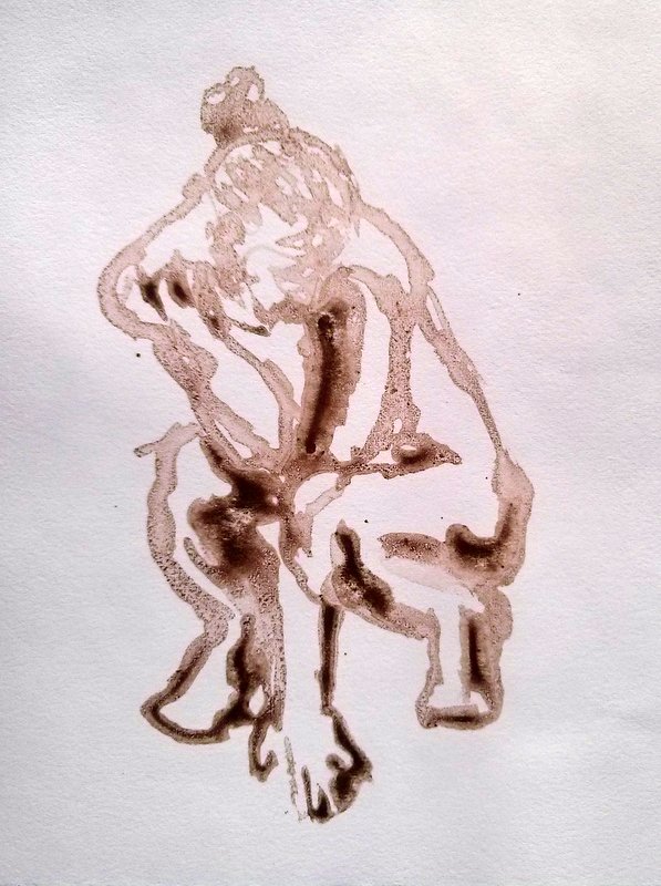
Drawn from the model with a bamboo pen (in water-soluble walnut ink) on frosted mylar, then transferred onto soaked and blotted Johannot printmaking paper. Approx. 6" x 4"


Same as above, but the plate was heightened with gouache and printed onto toned Ingres drawing paper.  The paper adds its own element of texture, especially in hand-pressing. Approx. 5" x 4"

20140629

Re-bedding the Lower Shroud Deck Plates

A year ago, I wouldn't have even known what that means. Now I actually know how it's done. Much more enjoyable to draw my husband while he's working on it, though. :)


Walnut ink, about 6x6" each. He was working, not posing, so these were done in 1 - 3 minutes each. Out of eighteen, these are some I like.

20130910

Zombie Self

 7" X 5", gouache on canvas panel

20121005

Life Class


Couple, 40-minute pose.  10" X 10", oil/gessoed BFK

There's a recently-organized life class available at the SD Art Institute (where I often show), and I finally had a chance to check it out.  Here's what I did there, in reverse order--the painted sketch above was the final (and, at 40 minutes, the longest) pose of the night. Prior to that, a 20-minute pose:


Couple 2, 9" X 9", oil/BFK

I've missed working from the figure, so even these short poses were fun to do.

Here are the earlier, shorter poses, done in pencil:


^Ten minutes


^Five minutes


^Two minutes...

and to be honest, I like some of those two and five-minute drawings best of all. 

I'll be traveling a lot for the rest of the month, two trips to Washington DC and lots of museum and gallery-crawling!  Hopefully I'll have some new work to post in November if not sooner.

20120915

"Selfie"


10" X 8", oil on panel.

There's nothing quite so humbling as staring at yourself for an extended period of time and trying to be honest about what you see.  It was time for me to do a new one, to document some changes in the past few months (hair length, glasses, weight loss).  I should try to emulate my friend Bill Sharp, who has done an annual selfie on his birthday, for many years.

Other news:  the painting a couple posts ago, Solar Charm, was awarded Juror's Choice in the September SDAI show.

20110426

FTFY, LL Bean


7" X 5", o/cp
In the world of nerds (like the one I'm married to) and internet forums (which I frequent), FTFY stands for "fixed that for you."  One alters and restates something to express a correction or one's own impression, adding "FTFY".  Here we have a sort of visual example.  I posted previously about the value of painting from fashion magazines or catalogs, for practice.  When I do this, often without thinking, I "correct" the model's proportions to reflect a more realistic physique--because very few people are size zero.  The figure above is one that I painted to look more like a real person.  Here's the source photo from the LL Bean catalog...it's not an egregious example, but still.  It's the principle of the thing.  Fixed that for you, LL Bean.

20110326

Figures

When you're stuck for ideas, or just warming up for your painting session, try knocking out some small, fast studies (try for 20 minutes).   Remember how it was when you were a kid and you just invented things to draw?   You can still do that, and practice painting at the same time.   It's surprising what emerges sometimes.  This first little figure has a plaintiveness that I really like.


Think about one or two elements while you're doing these--proportion/drawing, value grouping, color mixing.  The benefit is in "thinking with your brush" rather than trying to rationalize.  Every bit of practice establishing correct figure proportions will help when the time comes to work from a model.

If you don't have a model or any suitable photos, grab a fashion catalog.  Put up the photo and look at it as if it were a model, not right beside your canvas.  Try to get the gesture and proportion.


It's not essential to know human anatomy when mapping out a figure's proportions, but it is SO helpful if you want catch a realistic gesture.  Arms and legs are not just cylinders, and the shapes are in specific places for a reason.  I did not enjoy having to draw the skeleton and muscles over and over in art school, but it makes a world of difference to know how the muscles overlap and what structures underlie the shapes that you see.  In fact, knowing these things will enable you to see shapes that you would otherwise miss on the model, and to portray them convincingly even if your reference material doesn't show much detail (like this figure above).  If you're going to do much figurative work at all, I strongly recommend getting some good reference material on human anatomy and physiology.  This one is my all-time favorite, but there are many inexpensive guides (like $4 or less) also available which will get you started. 

And remember, if you paint from a copyrighted photo which is not your own, it should be attributed if made public.  These last two studies are based on images from a Hanes catalog.

20110206

Workshop Results, day two


Favorite painting of the day.  A 45-minute study, 10" X 8".  More about this later.

Today was about the figure, and we began with review of the proportions of the average adult body and how to map these successfully on the picture plane regardless of placement or clothing.  Peggi has a great DVD on this subject, and it's something that's always worth reviewing.

We started with two-color quick studies, using any two colors of different or equal value.  Here are mine, hastily photographed and then wiped off to re-use the board:


That middle figure was seated in a sort of twisted slouch that was hard to render quickly, but turned out to be good prep for the first longer study, below.  50 minutes, about 9" X 7".


The next pose was the model in the ballet tutu (painting at the top of this post).  In reality, she was standing flatfooted and holding a pole to keep her arms out in front of her.  I pointed her toe and tried to give her the build and posture that a dancer would have, relying on the model for the description of light and shadow.  Most of you know that the outcome of any figurative work is heavily influenced by an energy that we get from the model.  When that's lacking, we have to put it there however possible.  This is when experience and a knowledge of how the body is put together will save you.

To finish the day, we did head studies in three values, using varied light angles.  You can see some remnant landmark lines beside some of them, where I checked my drawing: