20171216

Lievens nearing completion

Probably one session left to finish this.


Up close, there is still quite a bit to do. We must keep the materials at least 4 feet from the painting, so adding a couple feet for the distance to my eyes, I'm actually about 6 feet away while working. From that distance, my copy looks amazing; but then I step up close, and the perfection in the original makes me want to hang up my brushes.

Lievens did quite a few paintings of this same model. Here are some links with images of other "tronies". I think it had to be the same model.

Sotheby's and Christie's

The magical part of copying a work is not knowing how some of the effects were created, then accidentally stumbling onto those methods while working. Like happy accidents, those "ah-ha" moments are what make the exercise so valuable.

20171215

Portrait project 4


Here are two portraits of the same sitter, and a story to go along with them. I'll start with the one that I feel best captures who he is.


He's confident, happy, has a megawatt smile. He's also a busy professional with very little free time. He's a football fan (Go Redskins!), so when he came by for a sitting, he asked if he could listen to the game on headphones while I sketched him. I always want people to be comfortable and at ease while I'm working, so I said sure! Unfortunately, the team missed a field goal and fell behind, so the expression I got was actually more like this:


Not that there's anything wrong with that, I was very taken with the drama that unfolded on his face, but I struggled terribly to complete an accurate likeness (later repainted it 8 times, and then abandoned)--because this really isn't who he is. Fortunately, I had time to chat with him enough to get to know him, and took some reference photos--one of which enabled me to get the likeness in the top image here. 

Yesterday I happened to talk to another portrait painter while painting at the National Gallery, and she mentioned how difficult it is to get people to come for a live sitting at all any more; they would rather just submit photos. People are busy, which is understandable, but a portrait painted from a photo without the benefit of "face time" with a sitter will never capture the same energy and character. There's something sublime that happens between the subject and the painter, that makes it possible to portray the sitter's best self: a blend of how they see themselves, how the painter sees them, and the essence of their personality. I am glad I had enough time with this guy to get to know him a little, because that's what saved me.


20171202

Lievens in progress


Last week, my husband took this shot of me working on my Lievens copy. Made good progress this week, starting the eyes and some of the skin tones:


The eyes, even unfinished, have brought the figure to life. Visitors love that, and for good reason. It's much easier now to envision the whole face. There is still much to do, probably three more sessions. I'm reserving the beard for last, because that seems to be the order that Lievens followed. The paint and scoring that make up the "whiskers" clearly overlap the skin and clothing.

I am using only an earth palette. Although I brought chromatic primaries with me, I didn't touch them. The "blue" eyes are painted with black and white, which is almost certainly what Lievens did. In isolation the color is grey, but in the warm context of the skin, they look very blue. Other than that, I'm using yellow ochre or raw sienna, earth red, burnt sienna and burnt umber. As for painting medium, I would love to use Venice turp which would give a lot more traction especially for the thicker passages of the skin, but real turpentine is not allowed in the NGA because of the stronger smell. Walnut alkyd medium works great for the glazing, adding translucency and a hint of tack and traction.Walnut oil is a nod to the original, since these masters were thought to use walnut rather than linseed. The alkyd helps it dry much more quickly than walnut or even stand oil would, alone.

If you haven't listened to the NGA podcasts about Jan Lievens, there are links in this post. Here is a slightly closer view of the copy at the end of the day:


20171118

Portrait Project 2 & 3

Here are the second and third in the series of portraits. In these difficult times, portrait painting makes me feel more connected than anything else to my fellow humans.


Haley and John, 12 x 12 oil on canvas.

20171117

New Copyist project: Jan Lievens

Here is the final image of my rendition of Van Gogh's Roses. I learned a lot about how he applied paint, especially as I worked the last stages. Much of what I attributed to the difference in paint texture was actually due to the manipulation with the end of the brush handle--some passages he didn't even apply with a brush, just drew them in with the end of the handle. That was a revelation.


My next project is pretty much the other end of the spectrum from Van Gogh. Jan Lievens (1607-1674) was a contemporary, friend, rival, and studio-mate of Rembrandt. He was very successful during his lifetime, but fell into relative obscurity afterward for various reasons. His work is incredibly luminous, like Rembrandt's, and in fact much of Lievens' work was attributed to Rembrandt for some time. Finally emerging from Rembrandt's shadow, Lievens has gotten the credit he is due.

In 2008 the National Gallery mounted an exhibition devoted to Lievens, and produced three 8-minute podcasts which are still available online. Listen to them here:
https://www.nga.gov/audio-video/audio/liev-wheel1.html
https://www.nga.gov/audio-video/audio/liev-wheel2.html
https://www.nga.gov/audio-video/audio/liev-wheel3.html

Here is a self-portrait from about age 20, when he was considered a prodigy:


Lievens and Rembrandt both painted many character studies, known as "tronies". The painting that I'm working from is one of them:


This is "Bearded Man with a Beret", from circa 1630, approx 21 X 18 inches. The description on the National Gallery website can be found here, as well as a high-resolution image that you can zoom in on to see the astonishing detail: 

This painting is on wood panel, so to approximate the smooth surface, I'm using Gamblin Oil Ground over gessoed smooth canvas. The surface of the wood panel shows through in areas where Lievens carved out shapes (more about that later), so I toned my surface to roughly that color. 

It's difficult to see in this photo just how much the painting seems to glow in real life. The skin is luminous, the eyes glisten, it's a masterful work. Lievens' glazing technique utilized a lot of the underpainting in an intense burnt sienna or earth red, showing through the thinly scumbled layer glazed over it. This is perhaps most visible in the chest area, where the grey of the garment is laid in very thinly, as is the deep umber of the background. For the first two sessions, I've worked on laying out a correct drawing on my canvas, and glazing an underpainting, trying to "reverse engineer' how Lievens established his values and what colors would show through where.

Here's a shot of my setup, halfway through the second session:


And at the end of the day:


I see corrections to the drawing that still need to be made, and since so much of the underpainting shows in the finished work, it really needs to be correct from the ground up. 

20171027

Progress on Van Gogh

Hoping to complete this next week. I'm restoring a little bit of the pink that Van Gogh intended, trying to be faithful both to his intent and to the current reality. If you haven't watched the video produced by the Met, it's a phenomenal synopsis of this painting's context in his work and approximations of what it looked like.
 https://www.youtube.com/watch?v=wJM3JhAfad8

After session #4, here's my copy.


20171018

Patuxent River from Mt Calvert

Here's a field sketch done at Mt Calvert Historical and Archeological Park in Upper Marlboro MD, overlooking the Patuxent River.

6 x 8" oil on gessoed bamboo card

20171012

Roses continued

Second session, my setup. This is how far I got after 8 hours total:


I'm taking pains to get the drawing right, especially since I've changed the proportions slightly. Using gridlines as a guide when drawing, allows those adjustments to made accurately across the whole surface. I've been reading a lot about how Vincent worked. That background color was applied in a thin layer at first, then the thick ribbons of  diagonal texture were some of the last strokes he added. He used dark blue to lay in the drawing, and those lines remain very visible and an important part of the composition.

Session 3, I'm starting on the leaves and flowers.


This is one of very few Van Gogh's to show revisions. Normally he painted very quickly with few revisions or corrections. Here, he added roses to the bottom of the vase and a sprig at left to correspond to one of the accompanying paintings. If you haven't watched the Met video yet, it's truly worth 8 minutes of time to understand so much more about this series of flowers.

The color issue: He used geranium lake, along with red lead in other paintings possibly because he knew that the lakes were fugitive but letters to Theo for needed supplies specify tubes of geranium lake for these paintings. His strategy, described in his letters, was to overload the color to compensate for future fading, but he couldn't have known they would fade all the way to white.

It's hard to know how much pink to put back. We have some photos from the 1920's and 30's but how reliable can those be? Color reproduction was dismal then, but we do know for certain that these roses were originally mostly pink:


20171009

Van Gogh Roses

Starting a new copy at the NGA, of Van Gogh's Roses. Here is the original:


This was painted in May of 1890, during his last hospital stay just two months before his death, as part of a series of four floral still lifes. The Met had a show in 2015 of all four, which included this painting from the NGA, one from the Netherlands, and the other two which are in the Met's collection. I'll be talking more about that exhibition and the scholarship that followed.

The value in copying a work like this is that it is radically different from the way I normally paint, which makes it a great exercise. The description on the NGA site notes that the roses used to be pink, but the fugitive pigment has faded so much that they are now almost entirely white. That inspired me to look up the research on what pigments he used, and what he may have intended them to look like. I want to share as much background as possible with curious visitors, and there is a lot to tell them about this painting. I highly recommend this 8-minute video produced by the Met for their exhibition, for the context of this work. The discussion of Van Gogh's fugitive colors begins at the 4-minute mark.

First session, I focused on the drawing. The proportions of my canvas are different but much closer than the Haseltine. 


There is a LOT going on in this bouquet. While Vincent was able to freestyle the composition as the flowers inspired him, my mission is to copy his work so my drawing has to be as close to his as possible. That's a much slower process, and this was all I could muster in 4.5 hours. His canvas shows through much more than one would think, given the impasto nature of most passages. The canvas that can be plainly seen is a buff color, so I chose raw sienna to tone my bright white canvas.

I'm reading a lot about Vincent's endlessly-fascinating life, which remains a source of interest and curiosity among those admiring his work. Two weeks ago, the NYTimes published an article about "Starry Selfies"-- New York's MOMA has a constant stream of people taking selfies in front of Van Gogh's "Starry Night". At the time, I was finishing up the Haseltine and thought "wow, that doesn't seem to happen at the NGA!" Turns out, it does happen here too, and the "selfie magnet" is hanging two paintings away from the Roses. It's this one:


20171004

the Portrait Project

Since I've just moved across six time zones to a new apartment community, I thought about this project as a way to meet my neighbors while sharpening my portrait skills. I posted the idea on the community web page, and got some interest. This is the first portrait of hopefully many. He's a retired Coast Guard veteran and cancer survivor. He moved here about the same time we did.

12 x 12 square, stretched canvas. I've also begun a new copy at the National Gallery, a Van Gogh. We'll see what happens with that!

20170929

Haseltine wrap-up


Next-to-last session, I started adding a lot of detail in the rocks and waves. Waiting until closer to the end to define the little figures by the large rock, because I wouldn't even want them there--but they are important for human scale against those rocks, another good decision by William Stanley Haseltine.


Prior to this session, I was thinking I had the sky color pretty well sorted out--but after a week away, I found it to be too dull. One major handicap that I had not anticipated, was the lighting in the gallery. The exhibited paintings are beautifully illuminated by spotlights, but Copyists' work on the easels are dependent on skylights for lighting. Every time clouds passed across the sun (which happens a lot here), my light changed. 

Those figures on the rocks, by the way, are so detailed in the original work that you can see the brim of the hat worn by the male and a ribbon around the hat of the woman seated next to him. I can't see that in the original from six feet away, so I opt out of that much detail in my copy. I also chose not to include the seagulls that were sprinkled about the sky.

Final result, oil on canvas, 18 x 24:


One of my favorite aspects of being a Copyist is talking with people from all over the world. I get to use all the languages I know, and I get to be an ambassador. Given the current political climate, I'm happy and amazed to still see so many visitors from overseas.

I was often asked why I chose this work to copy. As a landscape painter, I have a fondness for the 19th Century artists who made landscape their focus. And, being newly-relocated to the East Coast, I thought this would be a good way to vicariously explore the Atlantic coast, which is so different from the Pacific coast where I have spent most of my life.


20170922

Haseltine marching on


Fourth session was mainly about final decisions on composition, especially related to the rocks, figuring out where problems still existed and fixing those. The sky and water seemed like they'd be the easier problems to solve. (Ha!) At this point I finally have the horizon close to where it should be and it feels like the diagonals and interaction of the rocks are beginning to work as intended.


Fifth session, about 20 hours into it at the end of the day. Beginning to resolve the sky and water, but still not happy with the color. This photo is in poor light so not accurate, but Haseltine's sky palette actually was very subdued. It's difficult to know how much of that is due to time and varnish, but the work looks remarkably fresh for its age, and its provenance would support that impression, so now I have a decision to make. Do I mute those blues and greens all the way down to the point that he did? So many visitors have said that they like aspects of my work better than the original (even saying that to the guards, so they aren't just being nice to me)...  Maybe it's okay if my copy has a little bit of my style in it.

20170918

Haseltine continued

After the first session, I studied printouts of photos of my work in progress and considered how to keep Haseltine's rhythm and structure while changing the proportions of the work. This wasn't a challenge that I decided on ahead of time, it just turned out that an 18 x 24 was the only canvas I could get on a moment's notice...but now I'm really happy about it because it added another dimension to the exercise.

Visitors are universally kind and complimentary; even obviously-experienced painters are very generous with praise. Not all Copyists want this much interaction with the public, but as a former Artist in Residence, I welcome it. The Copyist program considers it part of the reason I'm there, and I embrace that.

By this point, I thought I better start washing in some local color...and that pretty much quadrupled the interest in the work!


I was mainly still struggling with the drawing and composition, but adding a little color did help me get more of a sense of how his composition worked to move the eye around, and I made quite a few more changes after this.

The following week, third session, I made more changes to the drawing and added more local color, still avoiding detail. There were lots of opportunities to explain how we construct a work, not by fully developing one section at a time, but by working the whole surface and keeping the development unified, slowly adding layers of color and trying not to kill the underpainting in the process.


 The single most often-asked question is, "how long did this take you?" People were surprised when I said, "About 12 hours so far." It reminded me of something that a visiting artist said during my BFA studies. She said (about demand for one's work), "People want something that looks like it took a long time to make." 

This is about halfway finished at this point, and I'm actually trying to slow it down more. As a plein-air painter, I've gotten into the habit of rushing to beat the changing light, and that is proving to be extremely difficult to overcome. Even as I'm explaining to a visitor that Haseltine painted this in the studio, not on site, and probably over a course of several months, I'm thinking "I gotta hurry up and finish this." Perhaps the most valuable part of the exercise was being forced to slow down, look carefully, and be very patient. It helped that I was forced to take a week between each session; I had very fresh eyes for the next session.

20170915

Copyist at the National Gallery of Art

In the grand tradition of learning by copying master paintings, the National Gallery of Art is one of the few remaining museums in the country which has a Copyist program. I applied for this months ago, knowing that we would be relocating to the DC area, and was accepted. I was able to begin my first master copy at the end of July.

I chose an East Coast landscape, something not far from my comfort zone but a challenge in that it's a studio work and the opposite coast from what I'm used to. Narragansett Bay in Massachusetts has a very different look and feel to Pacific coastline, so this was a good way to familiarize myself. Here's the original by William Stanley Haseltine, painted 1864:


Haseltine achieved fame for his "rock portraits", and the detail on this work is astonishing. I didn't aspire to replicate all the detail, but rather to ponder and learn from his decisions of color and composition. Copyists are not allowed to have the easel any closer than 4 feet from the painting, so our eyes are even further and much of the detail is lost anyway. We can walk up close to examine, but can't stay there to paint.

Being a Copyist is a lot like being an Artist in Residence, because a big part of what we do is interact with visitors and afford them the opportunity to see how a painting is constructed--something that is an unknown to most. I love talking with people from all over the world about art, art history, underpaintings, color palettes, and so forth. 

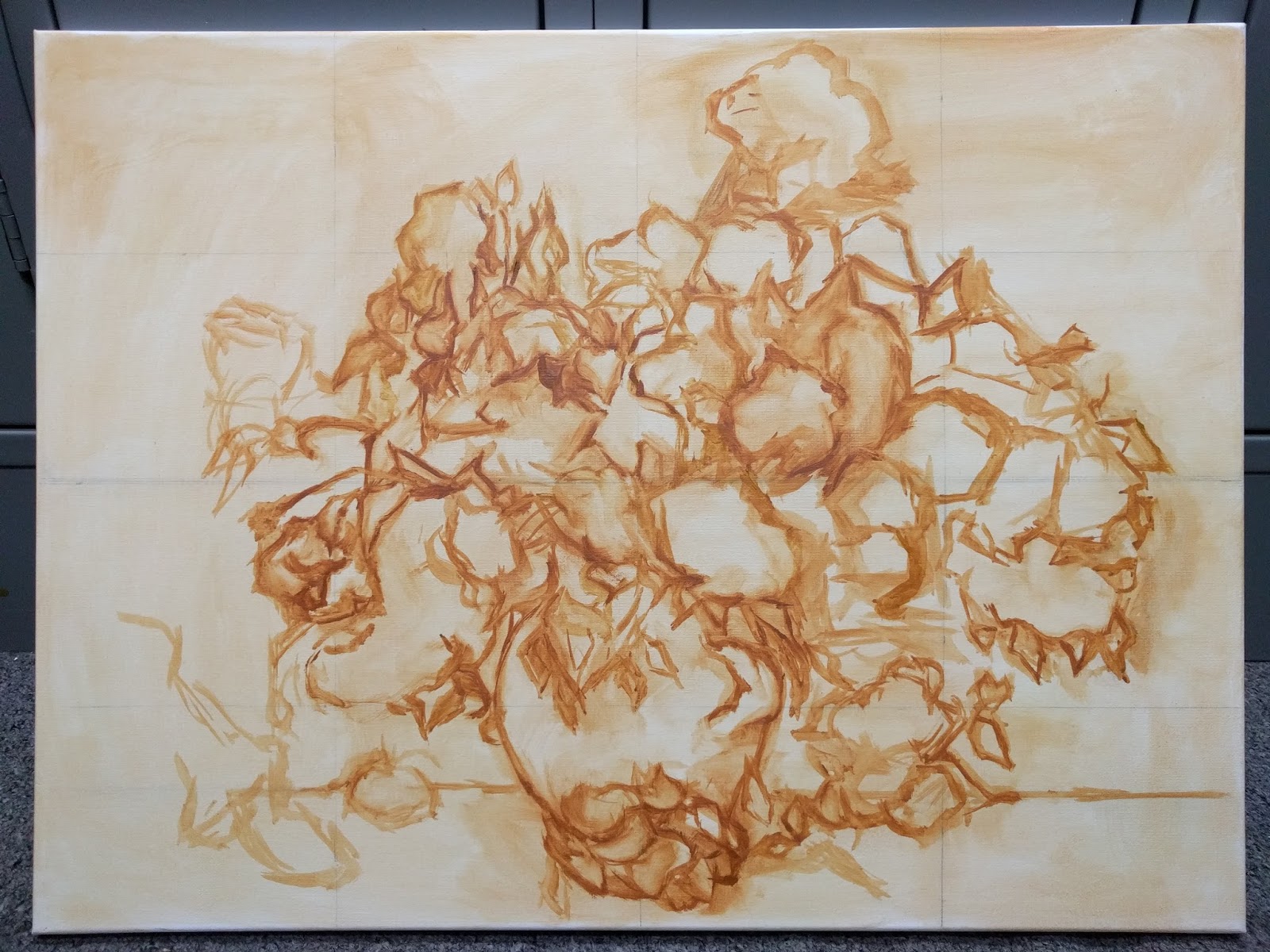
I started this just days after our plane landed in Maryland while our household goods were still in transit, so I had a field kit of shortened brushes, a handful of paint tubes, and a wooden palette. The National Gallery supplies the easel. I went to a Michael's craft store and bought a cheap 18 x 24 canvas, good to go. Of course that ended up increasing the challenge, because the proportions of that canvas are different from Haseltine's, and I didn't want to crop the image, so I decided to reformat the composition to fit my canvas. A supreme exercise.

Here is the first draft of the underpainting, after one 4-hour session.


And my setup in the National Gallery. Lots of visitors asking "why are you only using one color?" --teachable moments about underpaintings and layers. They appreciate the explanations and insights into a process that is mysterious to them. I would love to do this every day...but local resident Copyists are only given one day a week to work, between 10 am and 4 pm. There are about 30 of us, but I have yet to see another working the same day that I'm there.

The painting cannot leave the premises until the copy is done and documented, so it stays in a locker room set aside just for Copyists. After each session, I photographed the work in progress and used a printout of it to assess what I needed to change for the next session. And with the battle over proportion, there were a lot of changes.

20170913

Drawing as a Journal

The last blog post was about the fairly rigourous practice of natural history illustration. Nature journaling, on the other hand, can be as personal as a diary. The main reason to do it is to enhance your memory of your experience and to help you remember what you saw and questions to ask later, to learn even more. Graphite, colored pencils, and watercolor are all immensely portable and time-tested tools for recording the moment.


Nature journal pages from a couple hours in a park in Austin TX, watching Great-tailed Grackles and other birds. A nature journal is a personal record, not scientific or convening to standards. It's a way to remember what you saw and to ask questions to be answered later. It is not at all about creating a work of art. 
The best reason to do it is to remember that experience in a completely different way than simply taking photos. I'll never forget these birds, their sounds, their actions, even the weather and the feel of the breeze that day. And I learned a lot about them later by finding answers to questions I noted in the moment.

A journal can include sketches of anything. The scene outside your window each day, the clouds in the sky, anything you would like to remember having experienced or would like to research more later. As part of our recent move to Maryland, I've been finding images of fishes that are common here and sketching them for #SundayFishSketch on Twitter. Here are a couple of those, a Bluefish and a Longnose Gar.


For more about nature journaling, I recommend John Muir Laws, his books and videos. Among the many many books on the subject, his approach worked best for me. Audubon.org has an excerpted demo on How to Draw a Lazuli Bunting, and also here's an article on How to Go from Watching Birds to Drawing Them. As it says in the article, sketching doesn't just make you a better artist, it makes you a better observer of the natural world. And you'll make unforgettable memories, whether you make "art" or not.


20170911

Drawing as a learning tool

Drawing is a fantastic way to focus on just what's in front of you, a kind of mindfulness that can only be achieved by close observation and recording what you see. That presence in the moment is a sanity-saver when the world at large seems to be falling apart.

Natural history illustration is a fairly exacting discipline. I took the online course offered through EdX, one of their "Massive Open Online Courses" or MOOCs. It's free, or pay $50 for the certificate, your choice. It's a great intro to the field of scientific illustration, which has certain forms and conventions for recording and conveying observations.


Potoo, similar to a Nightjar or Tawny Frogmouth, native to South America. This rendering was my final project for the EdX Natural History Illustration course.


Deltochilum dung beetle. I became fascinated with dung beetles (and drew a lot of them) because of Emily Graslie, who exhorts all of us to remain curious and "be the dung beetle" that makes goodness out of being knee deep in shit, which we pretty much all are at this point. Take five minutes out of your day and watch this video. Guaranteed, it's worth your time.


Trypocopris, Sulcophanaeus, and Heliocopris dung beetles.


A typical format for analyzing the form and structure of a flower, for illustration purposes. Measurements, color notes, dissection, observations.

A recent article in Scientific American discussed the forgotten benefits of drawing as an adjunct to learning. There is really no better way to learn and remember.


20170909

Back

It's been a year since my last blog post, and almost that long since I painted. It was already a struggle after the death of a parent last year, but the result of the election and the national tragedy that has ensued took a massive toll and I was unable to continue working as I had been.

I found refuge in drawing. It's always been that way, from childhood--drawing is the true comfort zone, the untouchable place of safety and happiness. For anyone hitting a block in their work, I always recommend a return to the basics.  The 19th century Bargue drawing course became my focus as it has for so many artists over the years. The book and plates are public domain, available on Archive.org. I've completed 60 of the 70 plates, and will post a few.

Nature Journaling has also enabled me to focus on the beauty of the natural world, which has helped combat despair over the recently-accelerated loss of said natural world...  I highly recommend the work of John Muir Laws, for anyone who has an interest in sketching and documenting the beauty around us. His books and free videos are unsurpassable.

Things are looking up. My husband and I have moved across six time zones, and now live near Washington DC. I was accepted as a Copyist at the National Gallery of Art in DC, and have resumed painting now as I work from the Masters, which is something I've always wanted to do. I'll talk more about that and post those works as well.

This blog has been up for 10 years through good times and bad (actually 12, started in 2005, re-started 2007). For now, here are some of my Bargues to get this show back on the road.