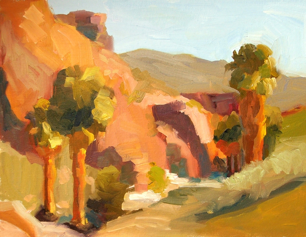
20110410

Sunlit Still Life


11" X 14", oil on stretched canvas.  The green of the background is actually a bit brighter than this.

20110407

Limited Strokes

Those last two still lifes ended up being a bit tight, and when that starts happening, practice with limited strokes is the cure.

12" X 10", oil/stretched canvas

10" X 12", oil/stretched canvas

7" X 5", oil/canvas panel

20110405

More still lifes with oranges...

I'm so behind on posting work.

10" X 10", oil on stretched canvas.

20110402

Still lifes with Oranges

Full afternoon sun:

and the next day, very hazy sun:

Both are 8" X 10", oil on stretched canvas. 

Haven't painted outdoor still lifes in quite a while.  The first day was clear with very strong sun, but the second day had a hazed-over sky with almost a misty feel in the air.  I didn't realize just how much the haze was diffusing the sunlight until I finished the painting and saw how low-contrast it looked. 

I like strong sun better.  :)

20110328

20110326

Figures

When you're stuck for ideas, or just warming up for your painting session, try knocking out some small, fast studies (try for 20 minutes).   Remember how it was when you were a kid and you just invented things to draw?   You can still do that, and practice painting at the same time.   It's surprising what emerges sometimes.  This first little figure has a plaintiveness that I really like.


Think about one or two elements while you're doing these--proportion/drawing, value grouping, color mixing.  The benefit is in "thinking with your brush" rather than trying to rationalize.  Every bit of practice establishing correct figure proportions will help when the time comes to work from a model.

If you don't have a model or any suitable photos, grab a fashion catalog.  Put up the photo and look at it as if it were a model, not right beside your canvas.  Try to get the gesture and proportion.


It's not essential to know human anatomy when mapping out a figure's proportions, but it is SO helpful if you want catch a realistic gesture.  Arms and legs are not just cylinders, and the shapes are in specific places for a reason.  I did not enjoy having to draw the skeleton and muscles over and over in art school, but it makes a world of difference to know how the muscles overlap and what structures underlie the shapes that you see.  In fact, knowing these things will enable you to see shapes that you would otherwise miss on the model, and to portray them convincingly even if your reference material doesn't show much detail (like this figure above).  If you're going to do much figurative work at all, I strongly recommend getting some good reference material on human anatomy and physiology.  This one is my all-time favorite, but there are many inexpensive guides (like $4 or less) also available which will get you started. 

And remember, if you paint from a copyrighted photo which is not your own, it should be attributed if made public.  These last two studies are based on images from a Hanes catalog.

20110324

DPW Help Japan Challenge

This is a benefit sale with all proceeds going to charities that directly benefit the stricken population of Japan.  The theme of this challenge is "home", so I've posted this La Playa Cove painting for auction, with all proceeds to go to the Japanese Red Cross.  This scene is the view out my window, but it's more than "home."  The tsunami showed itself here, elevating the tides several feet beyond normal with fluctuations that lasted for a week.  We were fortunate not to have any damage here (though other parts of California were not so lucky); but observing these effects here at home is a tangible reminder of the interconnectedness of all beings.


6" X 8", oil/cp.  The bidding starts at $50 for this painting, and if it goes over $100, then I am offering the winning bidder a second painting of La Playa Cove. 

Update:  These two paintings sold for a very generous donation, which I made to the Japanese Red Cross in the name of the buyer.  Thank you Michael!

"Cloudburst"  6" X 8", oil/cp

The benefit auction is still ongoing!
The link to the DPW page, with all paintings posted:
http://www.dailypaintworks.com/Challenge/FC50B15D-5016-4E5E-87F2-87C3F79BA65B

20110321

Indian Canyons


9 X 12", o/cp.  Finally getting around to blogging the last day of my three-day painting trip to Palm Springs and the surrounding desert.  This is from Indian Canyons, just three miles south of Palm Springs.  It's a wonderland of stunning rock formations and steep ravines.  There are miles of trails throughout this almost-untouched area of incredible beauty, sacred to the Agua Caliente Cahuilla tribe.  These views are toward Fern Canyon.  Palm Canyon Creek is in the foreground.


6" X 8", o/cp.  By the way, the seemingly infinite numbers of Washingtonia Fan Palm trees throughout Palm Springs and Palm Desert are indigenous.  They're the only palm tree that is indigenous to Southern California.

20110316

Coolidge Springs Road, near Desert Shores/Salton Sea

Above:  Morning light, looking west.  These are all 6" X 8" canvas panels.  Afternoon paintings below:


These scenes were side by side.   When put together, they make a nice diptych:

Most of the desert flora is very subtle in color, but that intense green shrubbery is creosote, which thrives in the harsh desert environment and can grow to be hundreds or even thousands of years old.  Very green leaves with grayish branches and yellow blooms.  Beautiful in the pinkish desert sunlight.  Here's a photo I took, it was everywhere and blooming like crazy:

20110315

Coachella Valley Preserve


Last week I painted with a workshop group in the desert near Palm Springs, Salton Sea and Indian Canyon.  Here are the efforts from day one, both are 9 X 12".  Things are quite a bit greener over there this year because we've had quite a bit of rain.


And while painting, I was visited by the beautiful creature pictured below.  Thanks to the internet, I can tell you it's a Desert Spider Beetle, Cysteodemus armatus, also known as the Inflated Beetle.  It ran around for a few minutes as if looking for something, then scurried off to safety.  The second shot shows the heel of a large shoeprint for scale.  You'll find a much better close up shot at this link.

20110312

Saturday Paint-out landscapes


These are from last Saturday, a paint-out with a great group here in San Diego, affiliated with SDAI and CAC.  We were at Sunset Cliffs Natural Park, one of the real treasures of living here.  It was the first plein air work I've done since working with PKR, and I was anxious to see how those principles would show themselves in my landscape work.  Simplifying the value plan, grouping the values, 2/3-1/3 balance, letting the color and the paint speak for themselves--it all works, regardless of subject.  These felt absolutely joyful.  They are small because I went there on the bike, so I had the 6 X 8 paintbox (see my setup in the photo at the top of the blog). 

Here are some pics of what I was looking at, more or less:


And here's a little resident who purposefully came RIGHT UP to me (that's my shoe at lower right), sat there and looked at me for about a minute, before meandering on.  So sweet.

20110306

Golden Beets


11" X 14", o/cp.  More goodness from the farmers market.  If you're not a big fan of beets, try golden beets.  They're sweeter and milder than red beets (which I also love), and their greens are fantastic.  So are the greens of red beets--never throw those away.  Paint them, then eat them.

20110301

Farmers Market!


Turnips, 8" X 17", o/c.  This is another Edges/Palette Knife study.  We have a great farmers market once a week, just a block away.  Organic local produce is unbeatable, and these turnips made a great subject for this exercise.

20110227

Edges, Palette Knife (cont.)


Three Cups, 7" X 14", o/c.    These are porcelain Japanese teacups (not sake cups, they're too big for that--although I suppose that's a matter of opinion).  They have no handles, which seemed to make no sense until I learned the principle behind it:  if the cup is too hot to pick up, the tea is too hot to drink.   Ingenious!

20110225

Edges, Palette Knife


Grapefruit and Apple, 8" X 10", oil on canvas.

20110223

20110219

The Creative Process

Here's a fun thing that I found on reddit.com.  I'll bet I'm not the only one who can relate.

 :)

20110213

20110206

Workshop Results, day two


Favorite painting of the day.  A 45-minute study, 10" X 8".  More about this later.

Today was about the figure, and we began with review of the proportions of the average adult body and how to map these successfully on the picture plane regardless of placement or clothing.  Peggi has a great DVD on this subject, and it's something that's always worth reviewing.

We started with two-color quick studies, using any two colors of different or equal value.  Here are mine, hastily photographed and then wiped off to re-use the board:


That middle figure was seated in a sort of twisted slouch that was hard to render quickly, but turned out to be good prep for the first longer study, below.  50 minutes, about 9" X 7".


The next pose was the model in the ballet tutu (painting at the top of this post).  In reality, she was standing flatfooted and holding a pole to keep her arms out in front of her.  I pointed her toe and tried to give her the build and posture that a dancer would have, relying on the model for the description of light and shadow.  Most of you know that the outcome of any figurative work is heavily influenced by an energy that we get from the model.  When that's lacking, we have to put it there however possible.  This is when experience and a knowledge of how the body is put together will save you.

To finish the day, we did head studies in three values, using varied light angles.  You can see some remnant landmark lines beside some of them, where I checked my drawing:

20110204

Workshop Results, day one


This is my favorite painting of the day, and it was the last one I did.  It's an example of simplified shadow mass (using one single color and value to represent everything in shadow), about 5" X 4".  I think this principle is particularly enhanced by the practice of "surface quality" where the dark values are painted thinly, and the light values have heaps of texture.

The first day was devoted to still life, and we started with value plans and converting them to color.  Peggi talked about the 2/3 -1/3 guideline: making a painting more visually satisfying by dividing any particular aspect into 2/3-1/3 instead of evenly divided in a painting.  Value, warm/cool color, it works for most elements of painting.  The first two studies below are, respectively, 2/3 dark 1/3 light, and 1/3 dark 2/3 light.  Both are roughly 2/3 cool color and 1/3 warm.


In making a value plan, we use 2-4 values, trying to not exceed 4.  Nonetheless, when we convert this value plan to color, there may need to be allowances made for the sake of "making a painting."  The value study below looked very promising, but converted to color, it presented a lot of problems.  I tried nine different color solutions and it still isn't working as well as I hoped.


Possibly the best result for this composition was found in the next exercise, Limited Strokes.  I think the painting below is a better solution, in 17 strokes.  Possibly because the warm/cool ratio works better, I'm not sure:


And my other limited strokes painting was an apricot in a blue dish, 16 strokes:


These are all exercises that can be found on Peggi's DVD series: Value to Color, Limited Strokes, and Simplified Shadow Mass.  The painting at the top of this post is an example of the latter, and I'm very happy with how it works there.  The one which preceded it is below.  It's a primrose with a small figure sculpture that Peggi did, pictured here from a slightly different viewpoint:


And the painting, using a different shadowmass color than the one above:


Tomorrow:  Day two, the figure.

20110127

Stuart Shils Painting Intensive

I'm leaving tomorrow for a weekend workshop with PKR, so there'll be some interesting things to document next week I'm sure.  In the meantime, here's information about a great opportunity to take a 3-day masterclass with Stuart Shils, here in San Diego at the end of April.  I am helping organize this, with Painting Perceptions (a wonderful resource, if you haven't discovered it yet).   If you need more inspiration to look into this intensive workshop, here's an interview with Stuart Shils that posted last month.  This is for intermediate to advanced painters, and it's not the usual technique-related instruction.  It's all about the perceptual process in front of nature, our editorial process, and how we respond to what we see, and how we create a painting from that. This will be a small group, 12 maximum, and expected to fill quickly so don't delay.  Click on the image below to see a larger (hopefully readable) version, or here is the pdf version.


20110123

20110113

Simplified Shadow Mass


I thought the principle would work best if all the elements in shadow were close in value when in light.  I'm surprised, the result is better than I expected.  Again, the gesture is very loosely based on a photo, but everything else is invented.  7" X 5" oil/canvas panel.

20110112

20110110

Ice Cream Scoop


6" X 8", oil on canvas panel.  A tiny (upside-down) self portrait, reflected in an ice cream scoop.  Which, if you think about it, speaks volumes... :)

20110104

Brides


4" X 5"

 Approx. 6" X 5".  Both are oil on canvas panel.