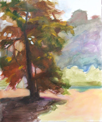
 Back in the studio, we spent the next day finalizing a layout and underpainting of the final work. I did mine on an 18 X 14 canvas, which seemed large compared to the small formats I've been using recently. At this point, we used the reference photo to nail down the details and composition. The photo can be manipulated in many ways, using an image program like Photoshop, to help visualize the final image. Besides cropping and contrast, we can edit out elements, or even superimpose the main object over a slightly different shot of the background. I didn't need to do anything that drastic.
 The composition of my plein air study was weak, because it's split almost exactly down the middle between tree and background. The gesture of the tree isn't clear either--it needs more visibility of the branches and sky-holes to show the graceful curving movement. Using a photo reference, it was easy to make changes in the painting's layout to remedy those problems as I laid in a thin-wash underpainting. Ray kept insisting, "no second guessing." The purpose of this stage is to completely resolve any and all elements of design, drawing, and detail. There should be no unanswered questions, so that the final stage is only about the color and paint application.
For me, this allowed the final painting to have a freshness and unlabored look, because when the final color went on, that's all I needed to think about. In the field, it's a constant balancing act between accuracy and freshness. There is a time constraint to catch the light before it changes, so we can't possibly nail down all the details fast enough. We fudge things a little, which works well in a small format; but in a larger work, those uncertainties will show. Painting from photos alone is not the answer, if we want to have true color and any sense of freshness. But Ray's strategy allows us to use the best of both.
"Sycamore", 18 X 14. (sold)

